/ Approach
Discover
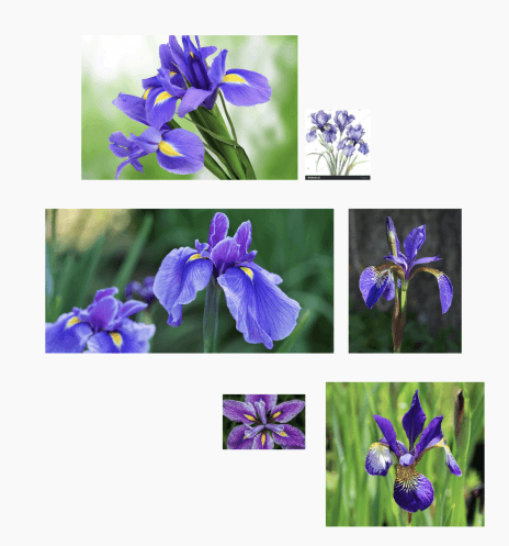
I began by researching the iris flower and its symbolism, particularly its association with clarity, insight, and perception. This gave the work a conceptual foundation that felt relevant to a project focused on incident reporting and operational visibility. I also reviewed AEMO’s broader visual language to understand how far the identity could stretch while still feeling connected to the organisation.
Define
I defined the design brief around three core qualities: clarity, coordination, and reliability. This helped turn an abstract branding task into a sharper design problem. The logo needed to feel distinctive enough for IRIS to stand on its own, but not so separate that it felt off-brand within AEMO’s environment. Scope was focused on logo creation and asset rollout rather than a full brand system.
Design
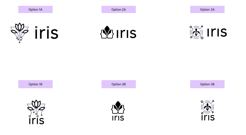
I explored several directions through sketching and concept development, testing ways to combine organic forms from the iris flower with geometric structures that reflected AEMO’s technical and data-driven context. After presenting concepts to the IRIS team, I refined the preferred direction into a stylised iris mark that balanced human meaning with structured precision. I also developed a supporting set of lockups and variations to ensure the identity could work across different formats and backgrounds.
Deliver
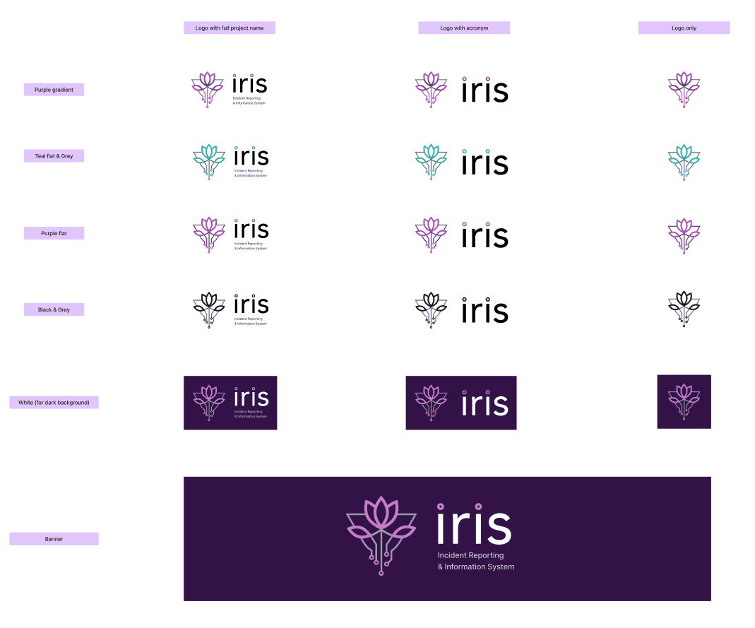
I packaged the final logo suite for practical use across digital, print, and presentation contexts. This included stacked and horizontal lockups, symbol-only versions, and light and dark variants aligned to AEMO’s palette. The handover focused on usability and consistency so the team could apply the identity confidently across project communications from launch onward.
/ Challenges & Solutions
Challenge:
Creating a logo that felt unique to IRIS without drifting away from AEMO’s established visual language.
Solution:
I used AEMO’s existing colour and visual cues as guardrails while exploring a distinctive symbol rooted in the iris flower. This created room for IRIS to have its own identity without feeling disconnected from the parent brand.
Result:
The final identity felt recognisable and project-specific while still sitting comfortably within AEMO’s broader design ecosystem.
Challenge:
Translating an abstract idea like “clarity and coordination” into a simple visual mark.
Solution:
I used the iris flower as a conceptual anchor, then simplified its form through geometry and symmetry to express structure, focus, and reliability.
Result:
The chosen direction gave the project a clearer narrative and a logo that carried both symbolic meaning and visual discipline.
Challenge:
Ensuring the logo worked across multiple internal use cases, not just as a single polished mark.
Solution:
I created a flexible asset library including stacked, horizontal, symbol-only, and light and dark variations to support different layouts and backgrounds.
Result:
The identity could be applied consistently across decks, dashboards, and documentation without needing one-off fixes or workarounds.
/ Conclusion
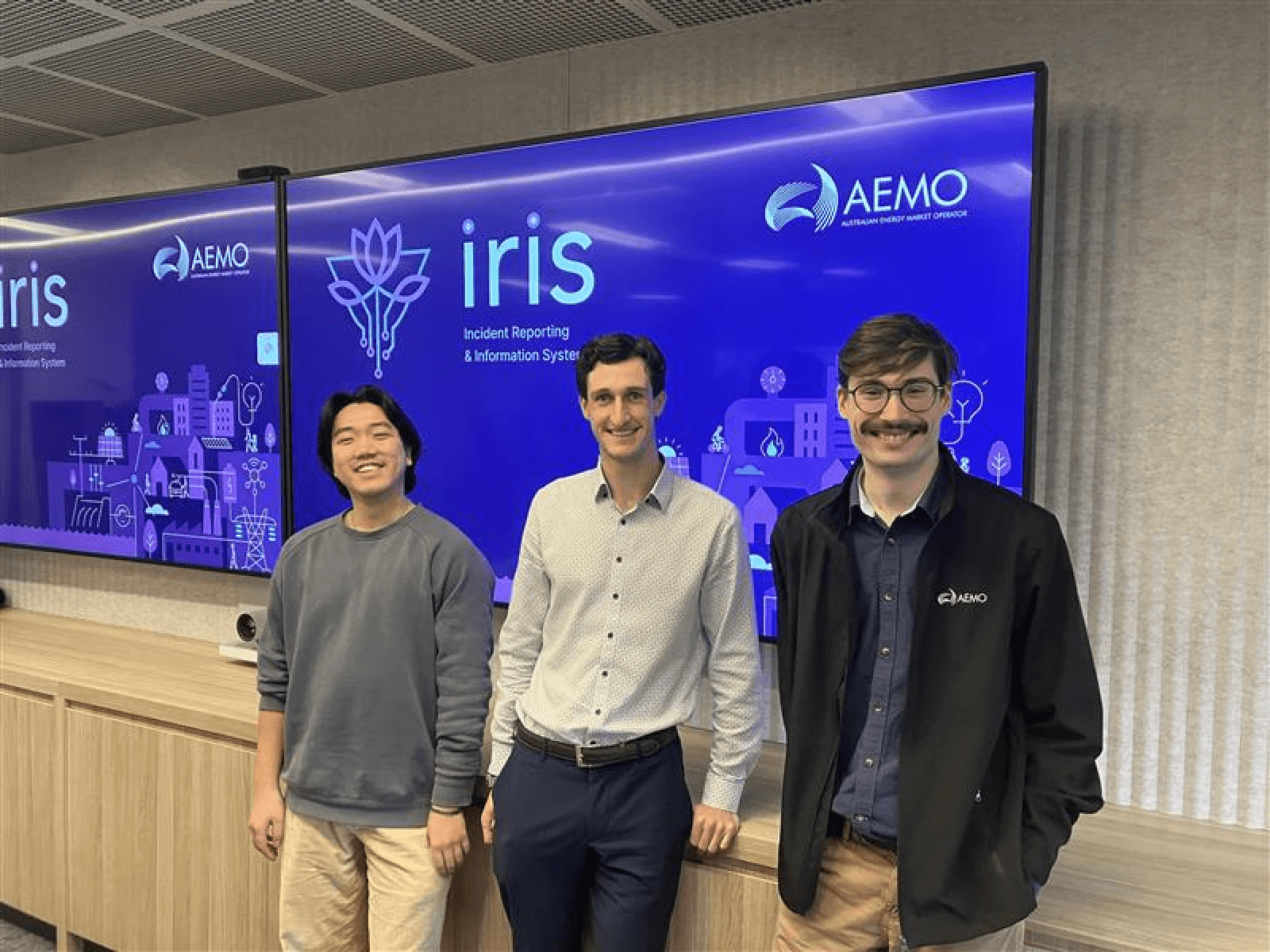
The final IRIS logo was met with strong support and excitement from the project team. It was immediately adopted across presentation decks, dashboards and documentation. During the project’s launch, the team proudly displayed the new logo on large screens throughout the operations space, celebrating their shared achievement.
The image of the IRIS team standing beside their logo captured the spirit of the project. The new identity gave the team a clear and confident visual presence within AEMO, symbolising both collaboration and purpose. The project showed how thoughtful design can strengthen team cohesion and create lasting value within a complex organisation.