/ Overview
/ Problem statement
Users managing account security relied on legacy workflows where sensitive actions lacked clear sequencing, confirmation steps, or outcome messaging. This made credential changes feel risky and error-prone.
Profile editability varied by user type, but the interface did not communicate which fields were editable and which were locked. Users encountered restrictions that felt like broken forms rather than intentional constraints.
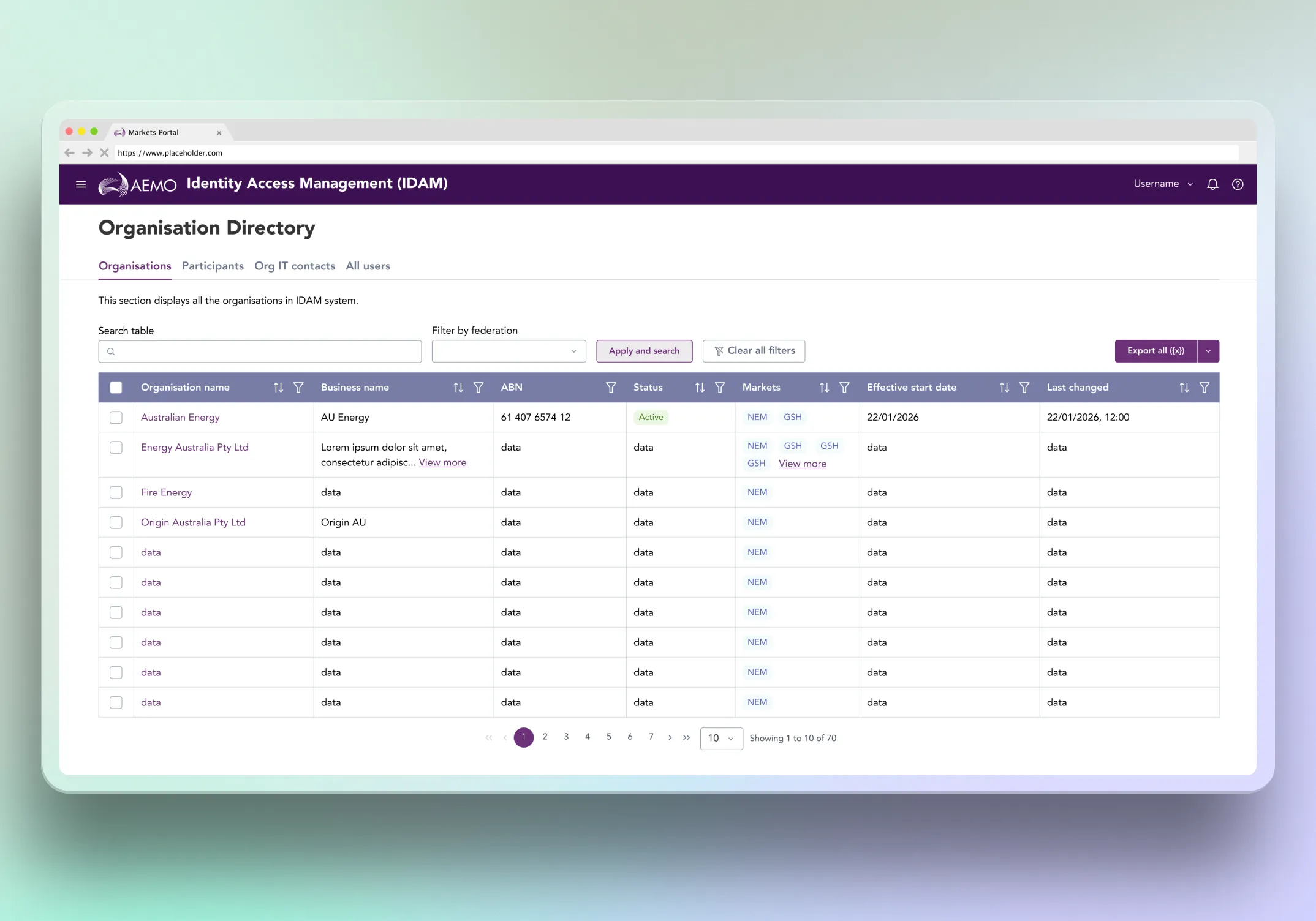
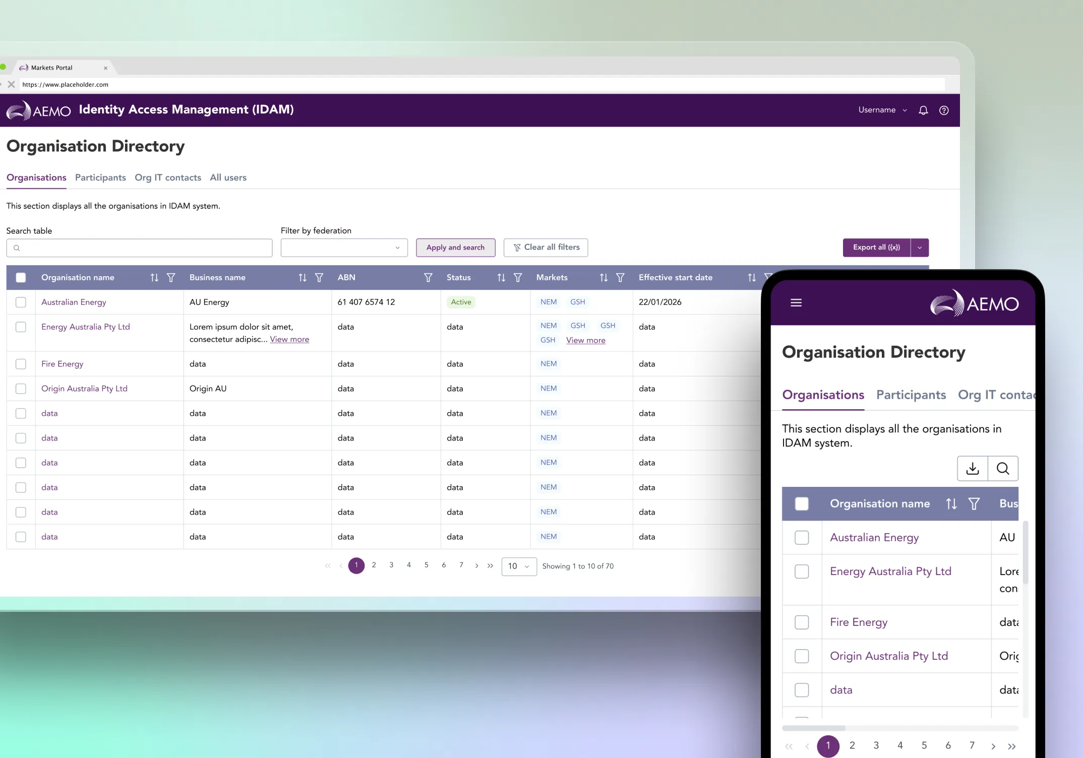
On the admin side, organisation and participant tables were dense, inconsistent, and hard to scan. Long text values and multiple tags broke row alignment. There was no standard pattern for truncation, filtering, or viewing full content, making it harder for admins to verify access context accurately.
/ My role
I designed the UX for the self-service and admin organisation context lane across both portals.
I worked with BAs to translate user stories, access rules, and field permissions into clear interface patterns, and partnered with developers to align designs with AEMO's design system and component constraints.
My focus was making identity tasks safer, clearer, and easier to implement.
/ Approach
Mapped identity tasks and constraints
I reviewed BA stories and mapped the core workflows in my lane: account security, profile details, and admin context views for organisation, participant, and user access decisions.
I identified key friction points: sensitive actions felt risky, user-type edit restrictions were not always obvious, and dense admin tables became difficult to scan. I also confirmed build constraints early, including reusable table patterns, responsive requirements, and design system limitations.
Defined access and editability rules
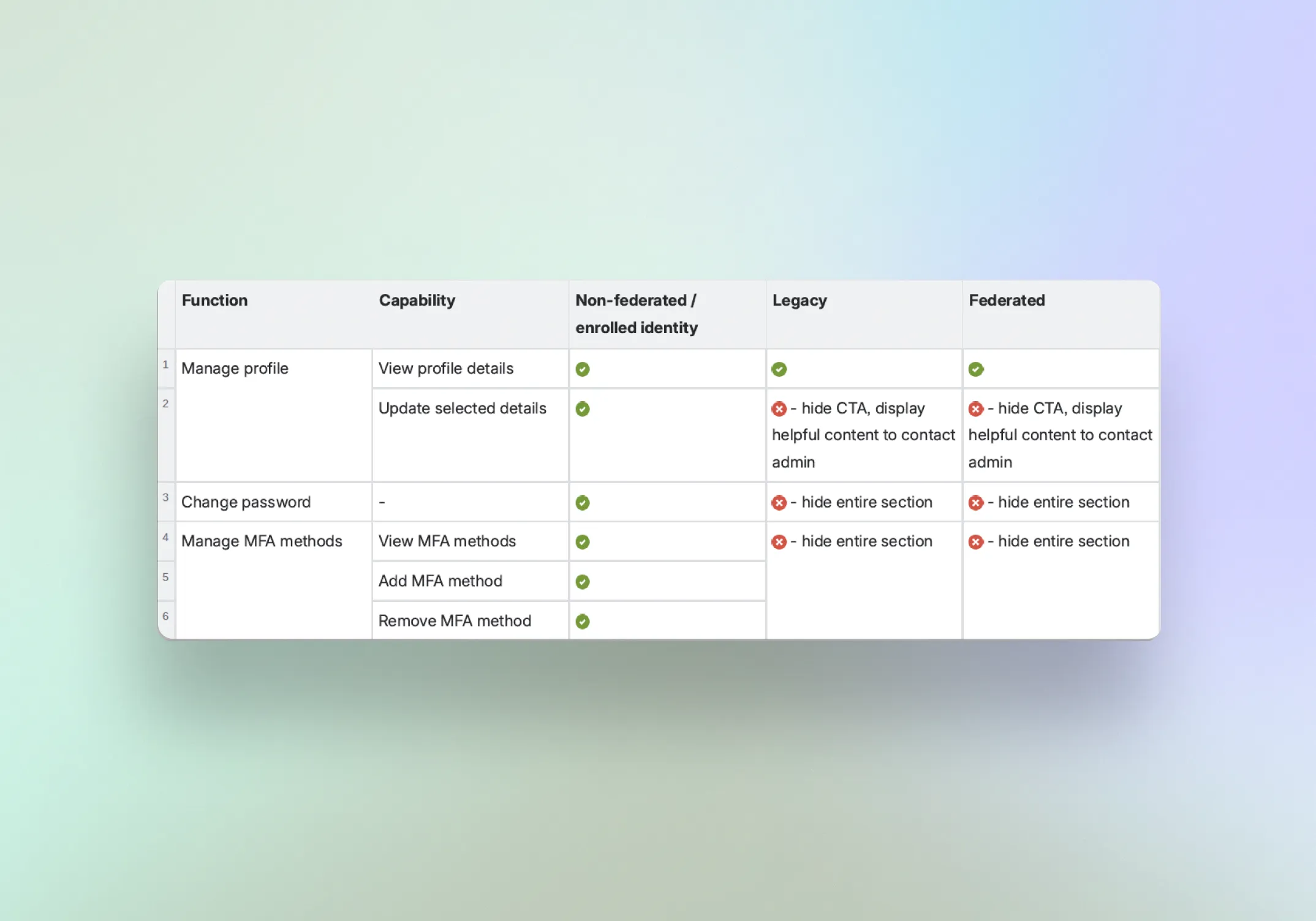
I clarified two related but separate problems: what users can see and what users can edit.
I defined visibility boundaries across system admins, organisation and participant admins, and business users. I also mapped how user types controlled profile editability, separate to roles, so the interface could make locked and editable states clear upfront.
Designed reusable self-service and admin patterns
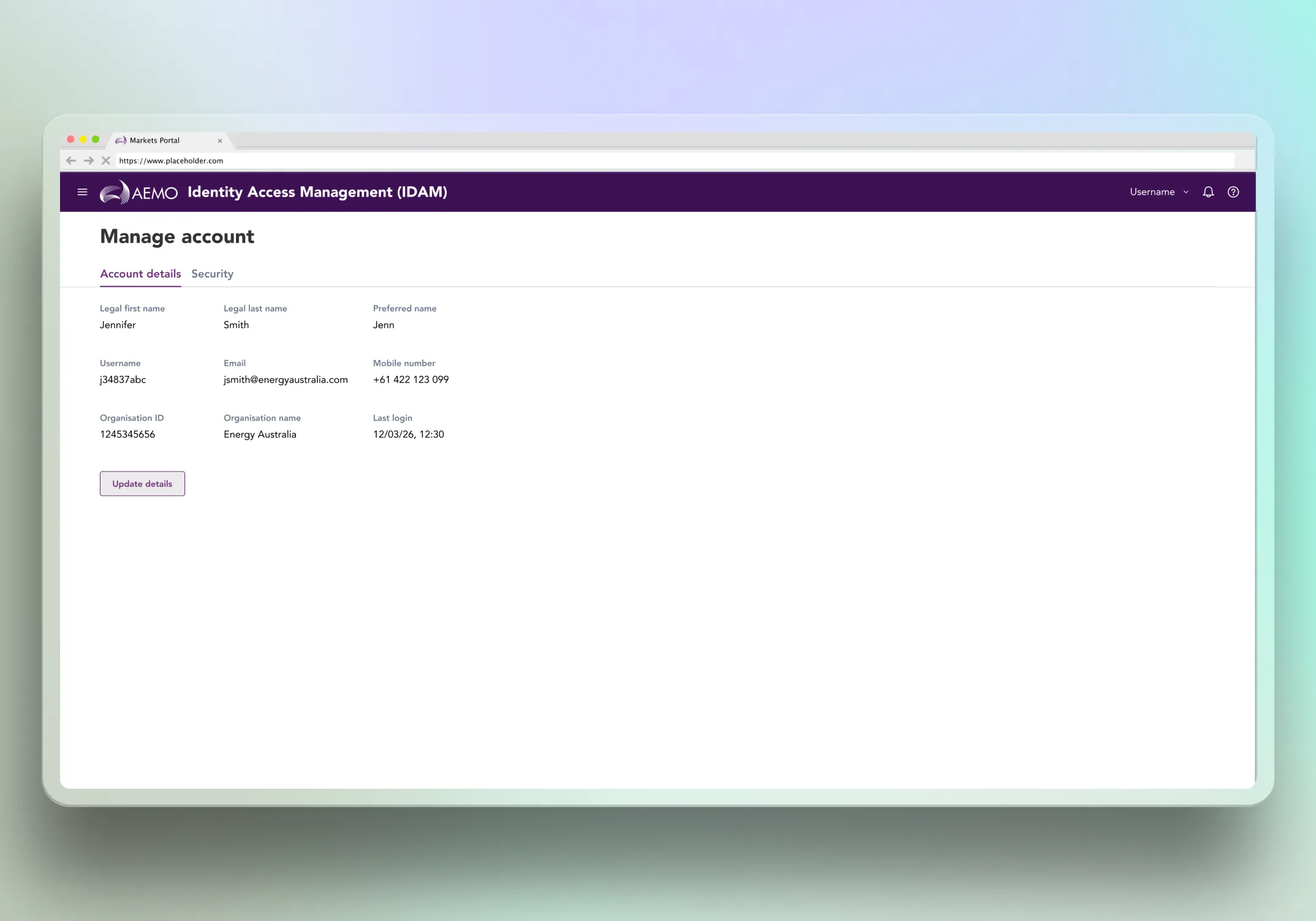
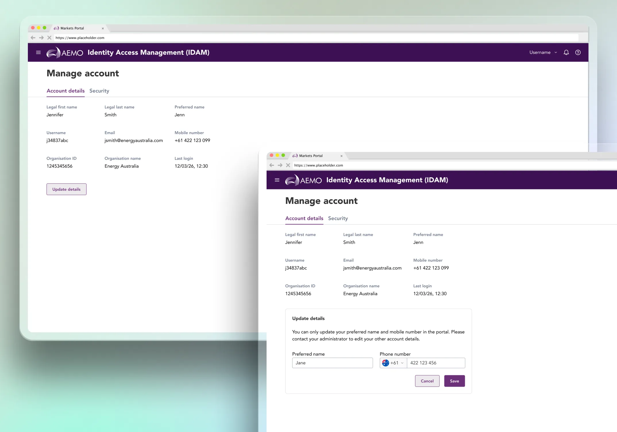
I designed a Manage Account experience that separates profile information from security actions, using clear sequencing, confirmation points, outcome messaging, and consistent error or session handling for high-impact tasks.
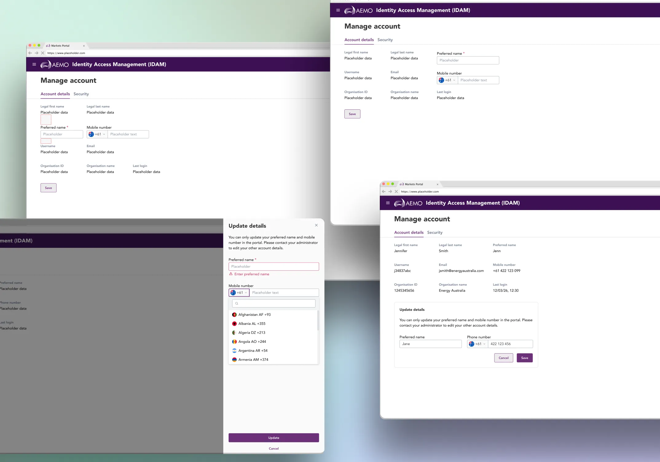
I also solved partial editability by testing multiple patterns and selecting an inline Edit container that only shows editable fields. This kept the layout stable, made constraints obvious, and avoided confusion across screen sizes.
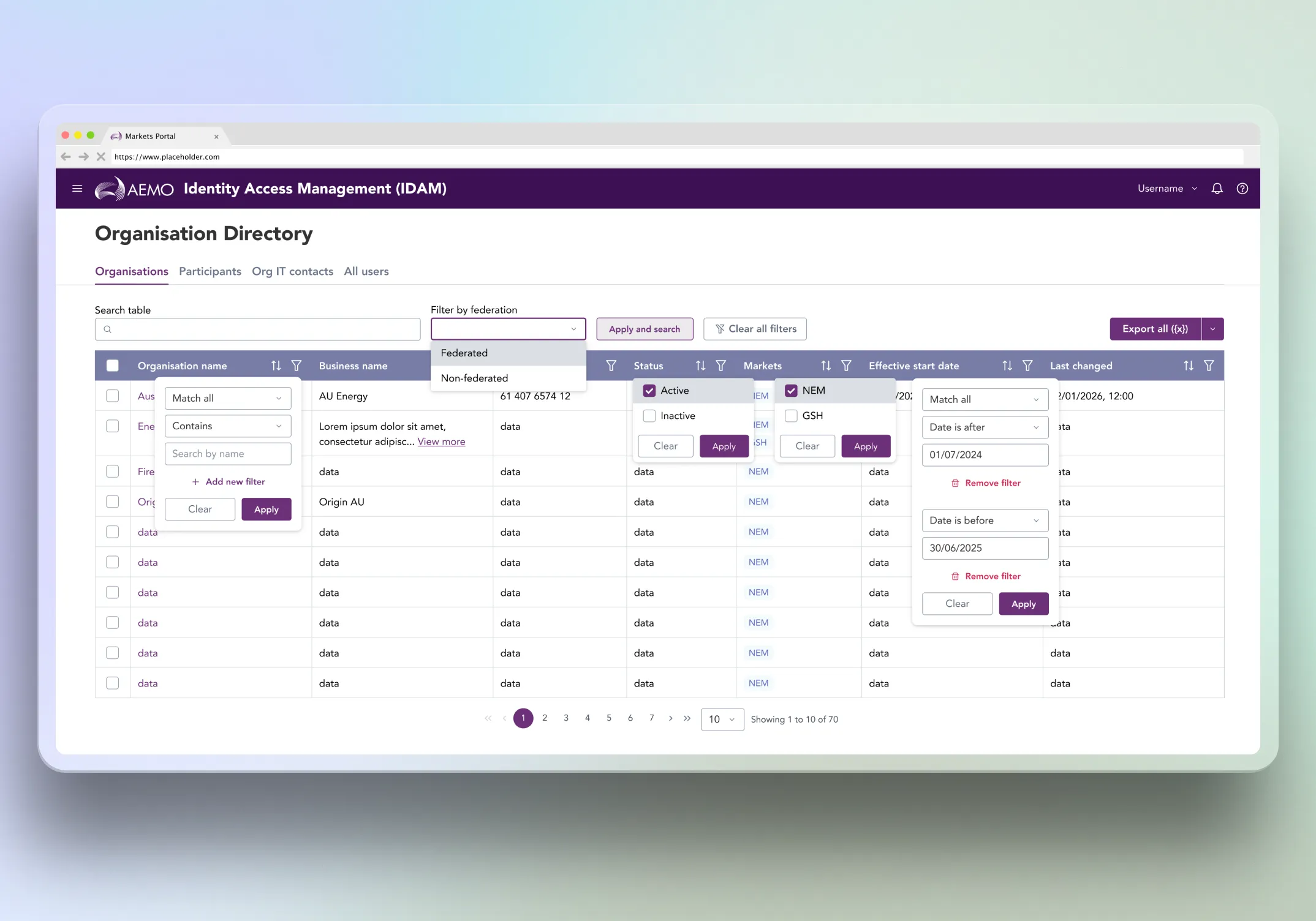
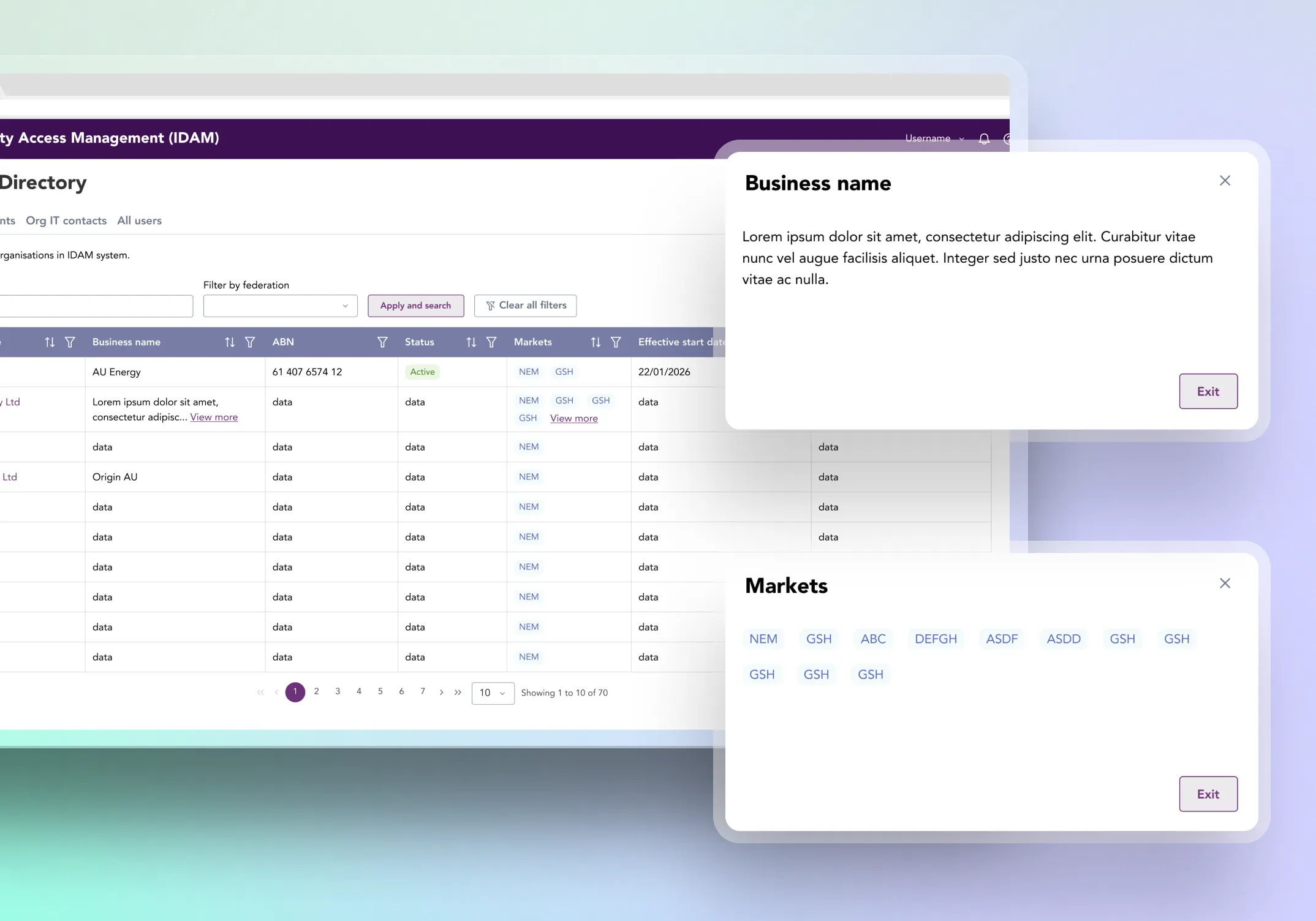
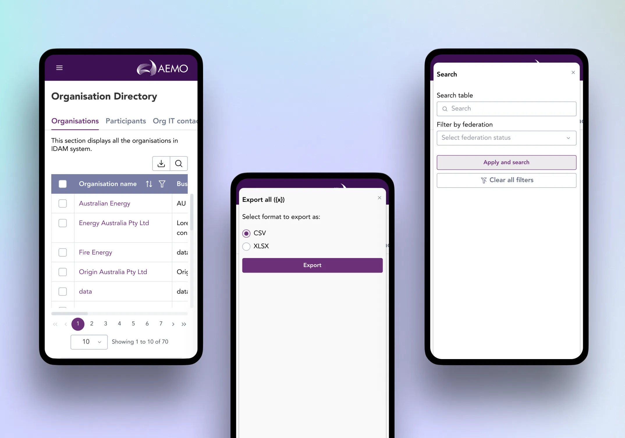
For admin workflows, I standardised table behaviours including search, filtering, pagination, export, two-line truncation, and “View more” modals.
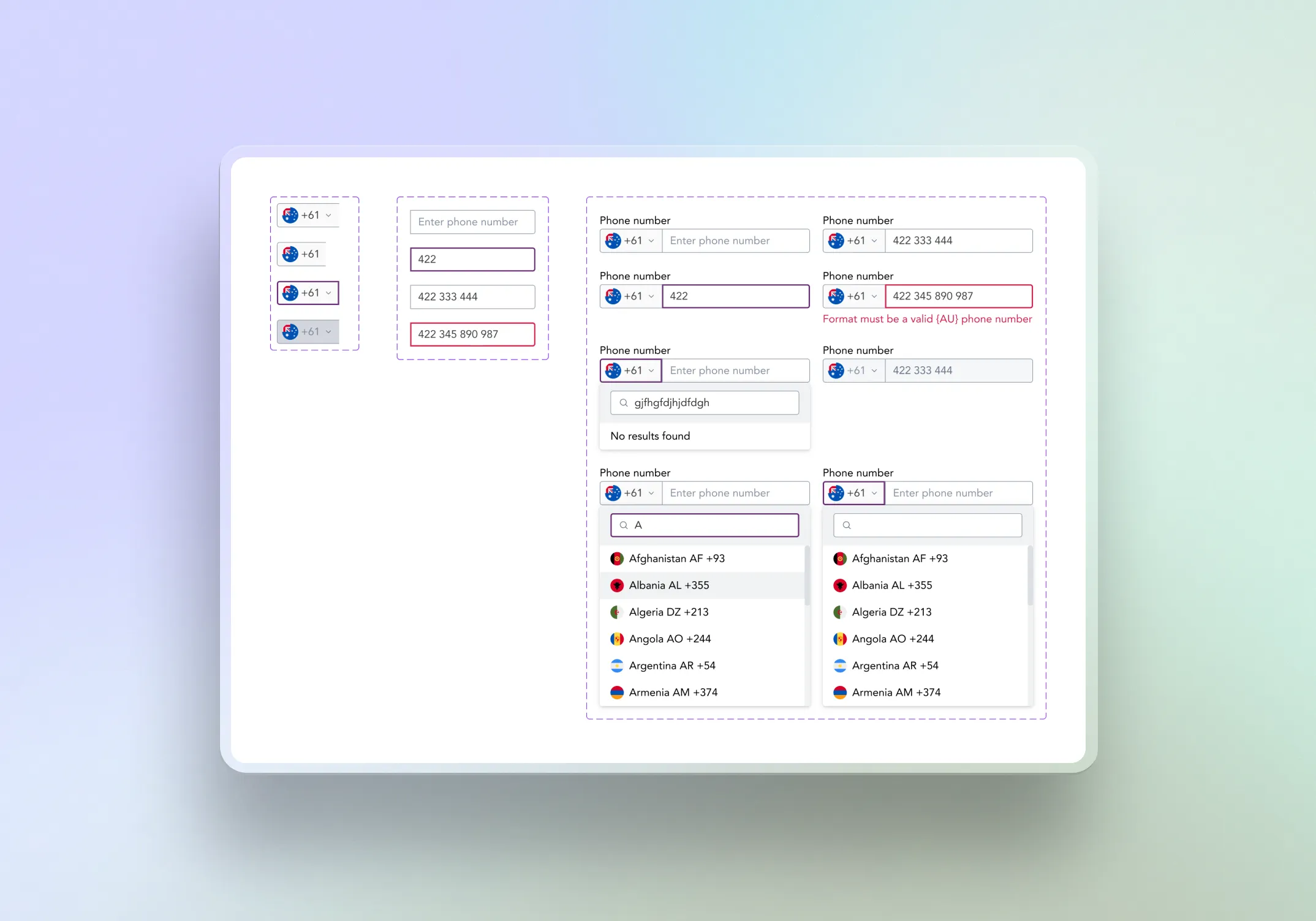
I also designed a reusable phone number component with validation, helper messaging, international support, and locked states.
Delivered build-ready designs
I delivered responsive wireframes, hi-fi screens, clickable prototypes, responsive references, and component behaviour notes for engineering and QA.
I also coordinated with adjacent registration and authentication streams to keep the identity experience consistent across AEMO’s Market and Internal portals.
/
Design workflow
Map identity tasks and constraints
Reviewed BA stories and mapped account security, profile, and admin context workflows. Confirmed build constraints early including reusable patterns, responsive requirements, and design system limitations.Define access and editability rules
Separated visibility from editability and documented how user types controlled field-level permissions, giving the interface clear logic for locked and editable states.Design self-service account patterns
Created a Manage Account flow with clear sequencing, confirmation points, outcome messaging, and consistent error handling for sensitive actions.Solve partial editability and table density
Selected an inline Edit container that only surfaces editable fields. For admin tables, introduced two-line truncation and a "View more" modal to keep rows scannable.Deliver build-ready designs
Delivered responsive wireframes, high-fidelity screens, clickable prototypes, and component behaviour notes for engineering and QA.
/ Challenges & Solutions
Partial editability felt like a broken form
Prototyped multiple patterns and selected an inline Edit container that only shows editable fields. This kept the layout stable, made constraints obvious, and avoided confusion across screen sizes.
Phone number capture needed to be accurate, reusable, and accessible
Designed a phone number input with a country selector, searchable country list, clear "no results" behaviour, and defined input rules so formatting stays consistent. The component was built to be reusable across both portals.
Dense admin tables were hard to scan
I introduced a consistent two-line truncation rule and a "View more" modal pattern. This kept rows predictable while still allowing access to full content when needed.
/ Outcome & next steps
The designs improved day-to-day identity workflows by making account security actions safer and admin context views clearer and more consistent. Constraints became visible rather than surprising, and key interaction patterns were standardised across tables and forms.
The work also established reusable patterns, including the phone number component, inline edit container, and table truncation model, that could be applied across the broader IDAM program.
Next steps would include usability testing with internal and external portal users, validating the patterns against additional admin workflows, refining accessibility checks across responsive breakpoints, and supporting adoption of the reusable components in adjacent streams.