/ Approach
Discover
Starting from scratch, we focused on auditing existing design assets and identifying key challenges. We needed a design system that was easy to use, scalable, and fully compatible with Pega, enabling government teams to build digital services more efficiently. Key questions we asked included:
How can we organise the design system so users can easily find and implement components?
How can the system adapt across all government services?
How can we ensure responsiveness for various screen sizes?
How can we provide clear guidelines for developers to align with the design?
Define
Defining the principles
The design system was built around five core principles:
Scalable
A system that grows with the organisation’s needs.Trustworthy
Reliable and well-documented for smooth adoption.Simple
Easy to understand for users with varying design experience.Efficient
Promoting reusability to speed up workflows.Cohesive
Ensuring consistency across all services.
Defining the solution
The result was a comprehensive design system that provides:
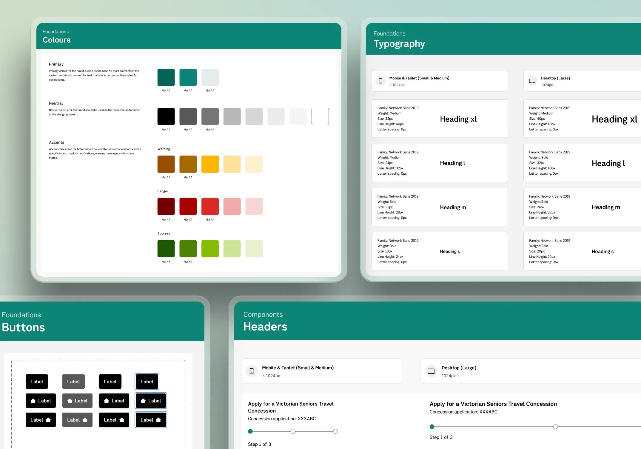
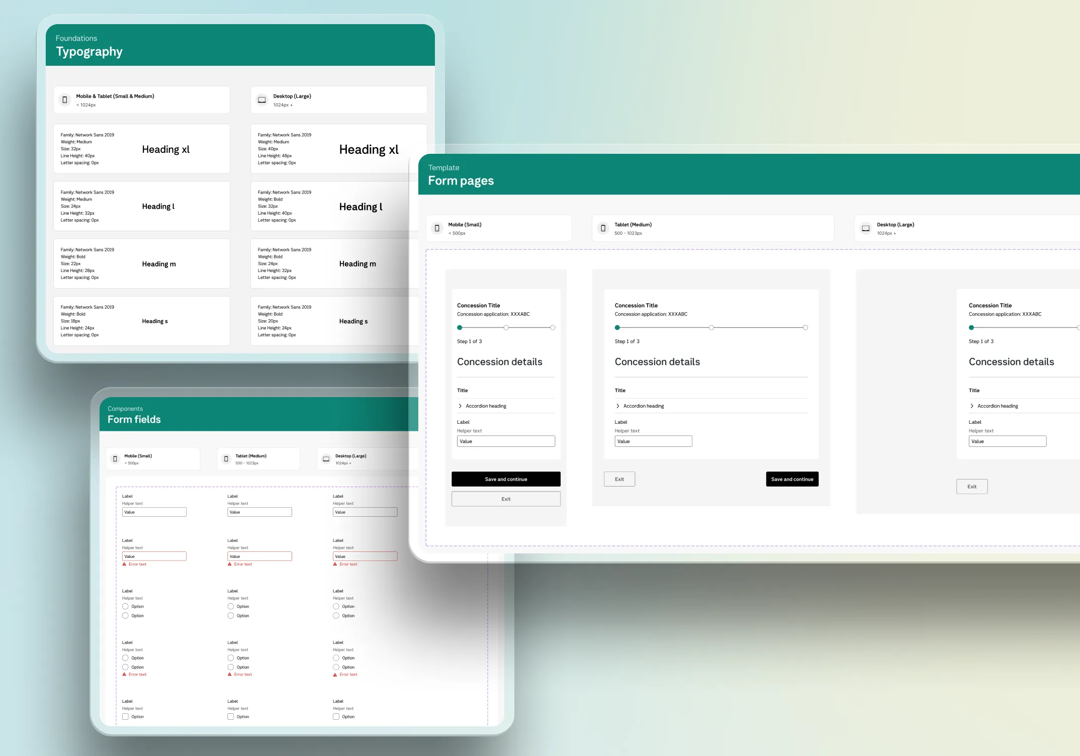
Foundational elements
Core styles like colours, typography, and spacing.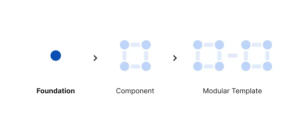
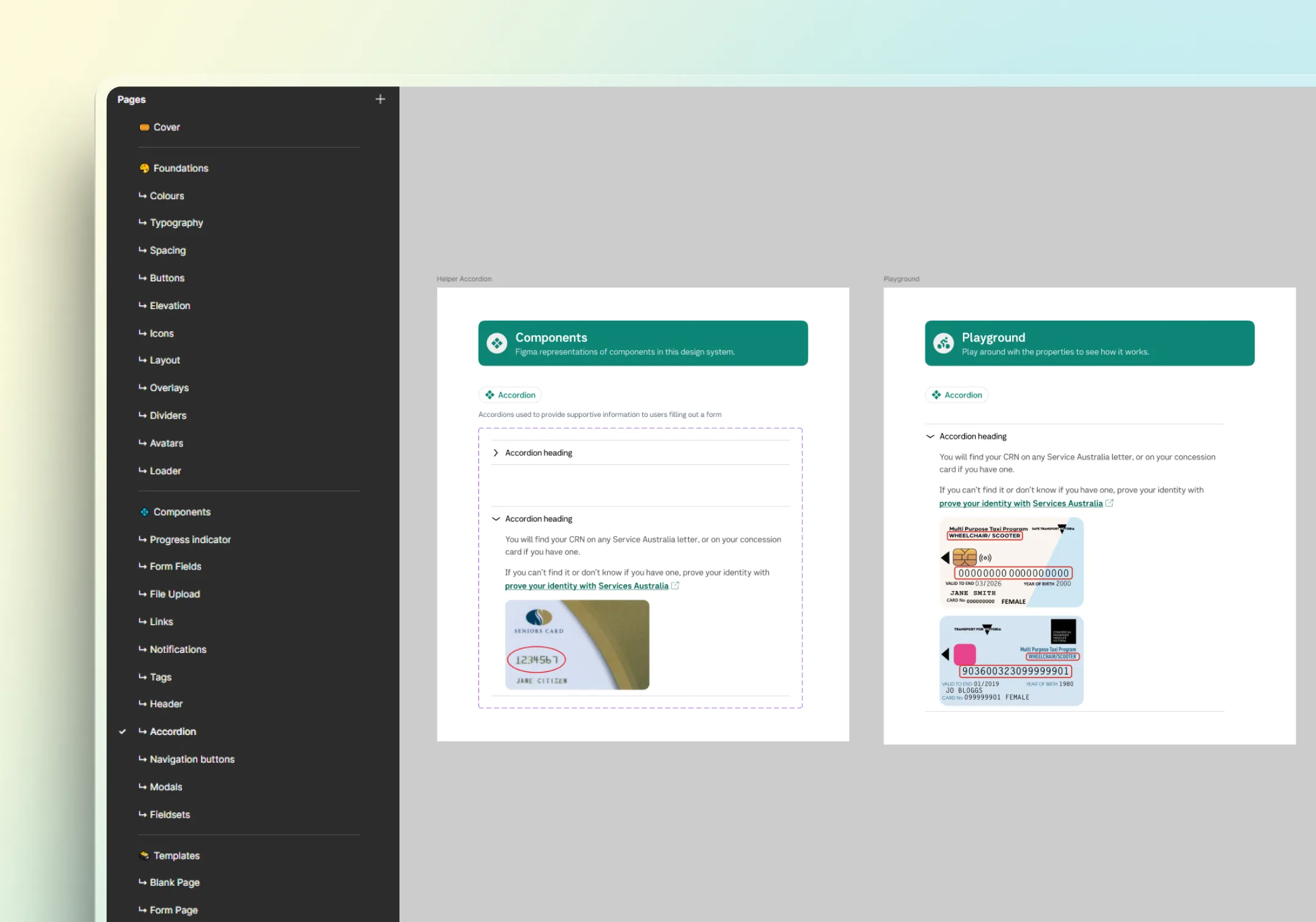
Reusable Components
UI elements that streamline design and development.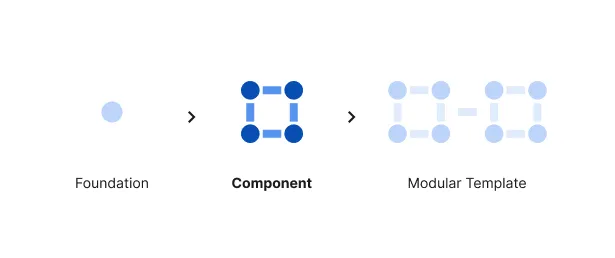
Pre-Built Templates
Layouts for common design patterns to improve efficiency.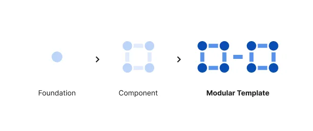
Design
We prioritised consistency and scalability while allowing room for growth. Key elements included:
To maintain uniformity across government services.
A modular approach for easy updates and enhancements.
Meeting WCAG 2.1 AA standards to ensure usability.
Interactive documentation to minimise implementation issues.
By balancing structure and flexibility, the system ensures teams can work efficiently while delivering high-quality digital services.
Deliver
The design system included:
A collection of foundational styles, reusable components, and templates.
Simple adoption and scalability.
Agencies can easily adapt and expand the system.
Documentation:
Clear explanations of each component.
Do's and don'ts for correct usage.
Example images showing real-world applications.
Usage rules to ensure proper implementation.
/ Challenges & Solutions
Challenge:
No existing single source of truth
Solution:
We established a centralised design system with shared foundations, reusable components, and clear documentation.
Result:
This created one reference point for patterns, usage, and decision-making, helping teams work more consistently and reducing ambiguity across projects.
Challenge:
Aligning design quality with Pega platform constraints
Solution:
We designed the system with platform feasibility in mind from the start. Components, templates, and behaviours were shaped around what could be realistically built in Pega, while still meeting usability, accessibility, and visual consistency goals.
Result:
The design system was more adoptable by delivery teams because it balanced ideal design outcomes with technical reality.
Challenge:
Designing for scale across varied government services
Solution:
We used a modular structure with foundational elements, reusable components, and flexible templates. This allowed teams to maintain consistency while adapting the system to different service needs and future expansion.
Result:
The system provided enough structure to unify experiences, while remaining flexible enough to support broader agency use over time.
/ Conclusion
By aligning the design system with Pega’s requirements and addressing its limitations, we created a scalable, accessible, and maintainable solution that improves efficiency across government digital services. The system enables seamless collaboration between designers and developers, ensuring accessibility compliance. With this foundation, future iterations will focus on expanding capabilities, improving performance, and enhancing the user experience within the Pega framework.