
/ Approach
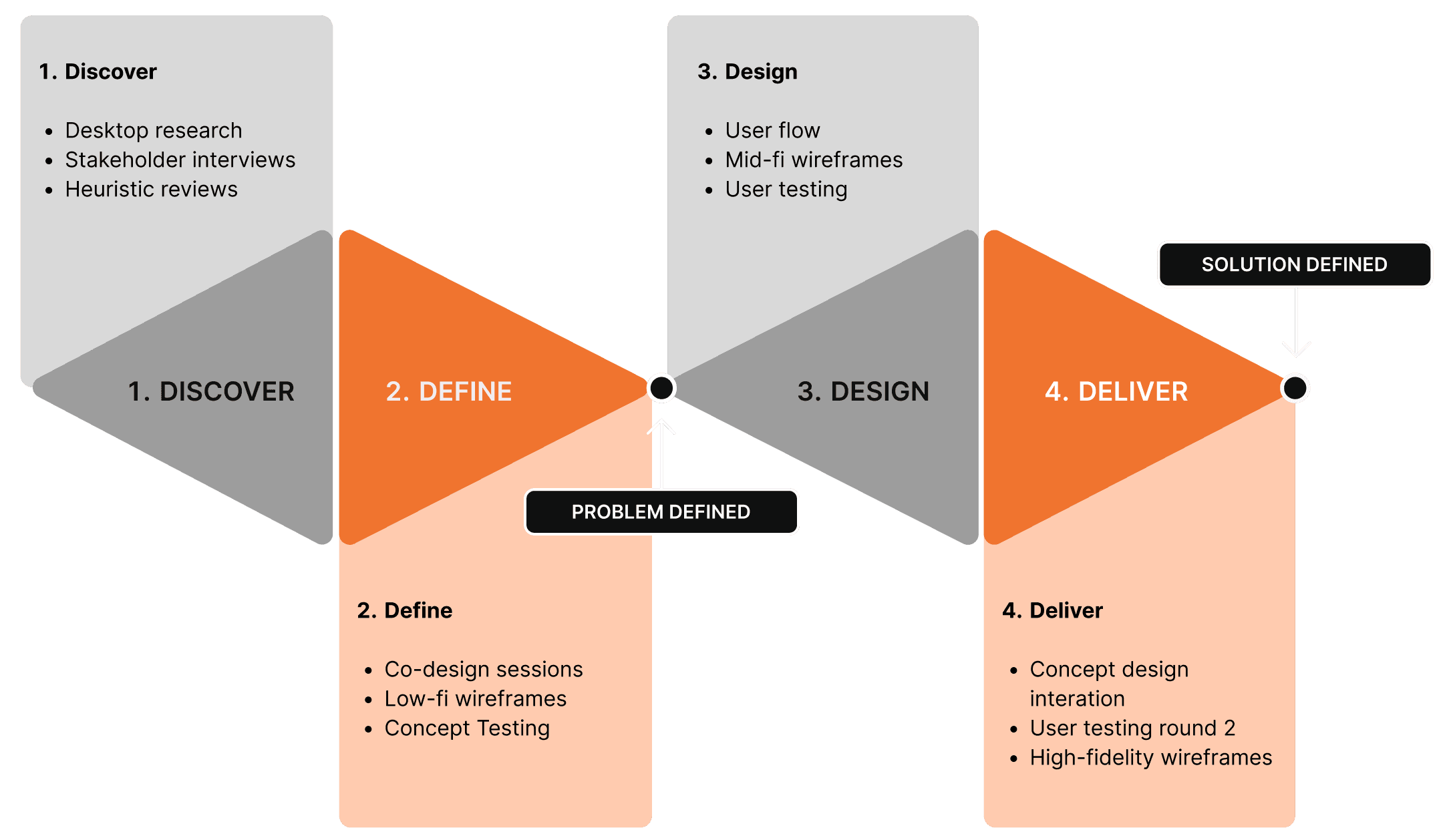
Discover
Guided by the Double Diamond approach, we structured our process into four phases—Discover, Define, Design, and Deliver—to ensure a robust, member-centered solution.
We started by understanding the existing experience across the two career development tools and identifying where members were struggling. The team reviewed 1,500+ pages of existing research and interviewed 16 stakeholders to build a clearer picture of member needs, business priorities, and gaps in the current experience.
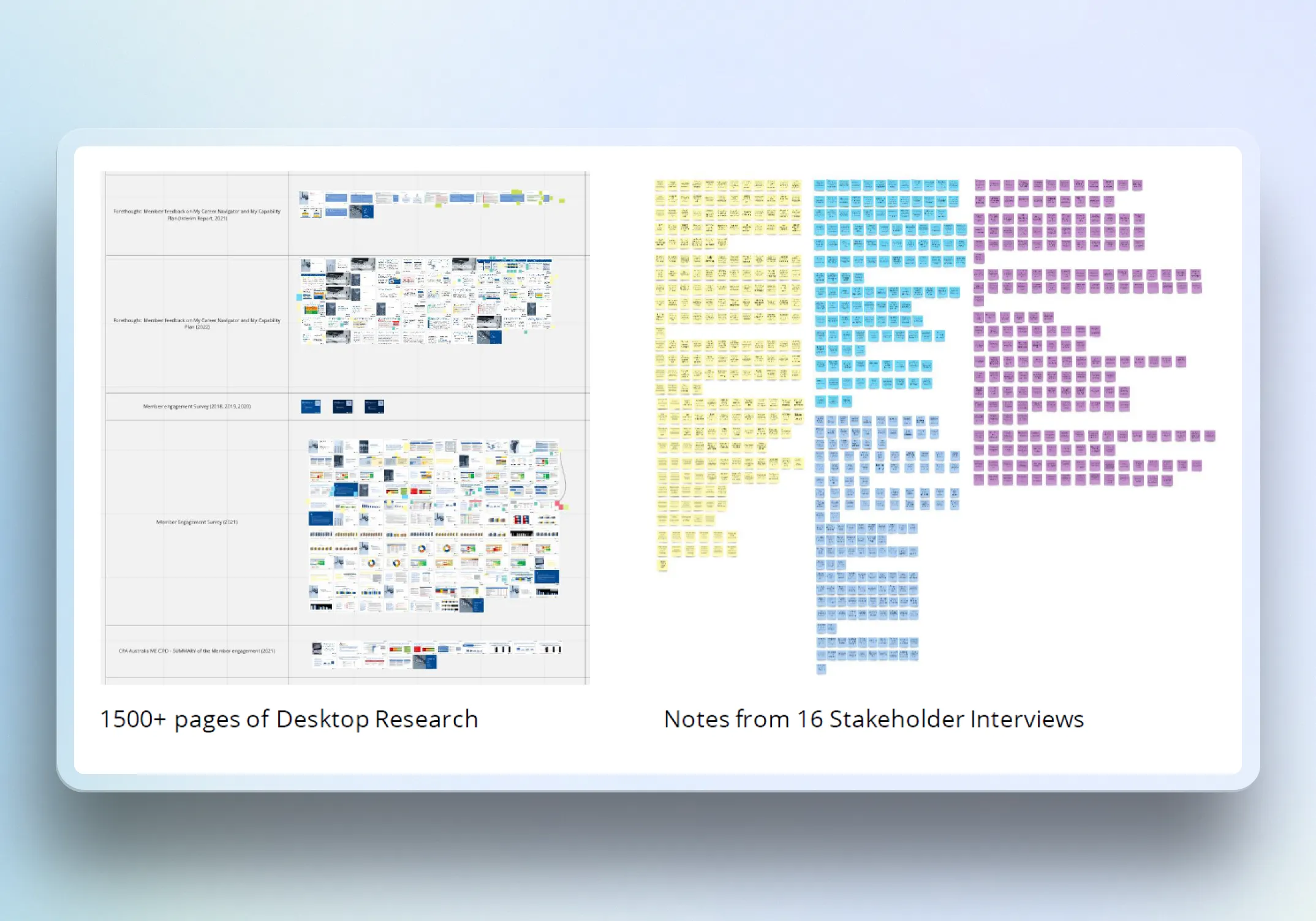
We also assessed 32 comparable platforms and captured 140 benchmark data points across content structure, navigation, and functionality. This helped ground design decisions in patterns already familiar to users while highlighting opportunities to simplify and modernise the CPA experience.
Define
From our discoveries, we identified key issues and pain points. Members found the existing tools overwhelming, with content described as a "dump" of information that hindered easy access to the institution's valuable resources. These insights helped us prioritise essential features that would address members' desire for accessible, relevant, and streamlined CPD content.
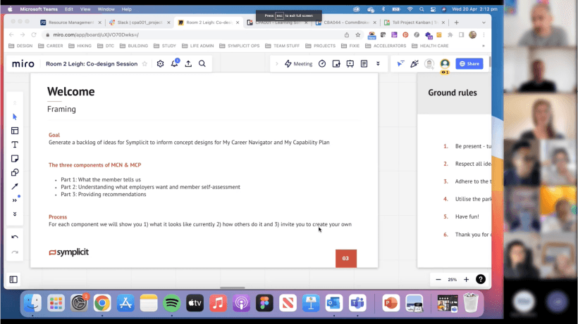
Working with 14 stakeholders across seven business units, we co-created 458 ideas and used those sessions to surface priorities, align on opportunities, and narrow the concept direction. From there, the team focused on shaping a more unified experience centred on clearer content pathways, easier access to relevant resources, and a more coherent platform structure.
Design
My focus was translating the research and strategic direction into interface concepts that felt clear, modern, and usable. I explored early concepts through paper sketches and low-fidelity wireframes, then refined shortlisted directions into mid-fidelity prototypes for testing.
We refined into structured user flows.
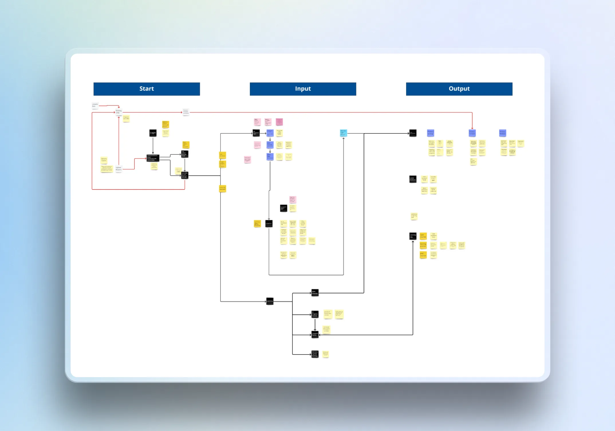
Starting with low-fidelity wireframes, where we brainstormed a series of concepts on paper before translating the shortlisted designs into the digital space.
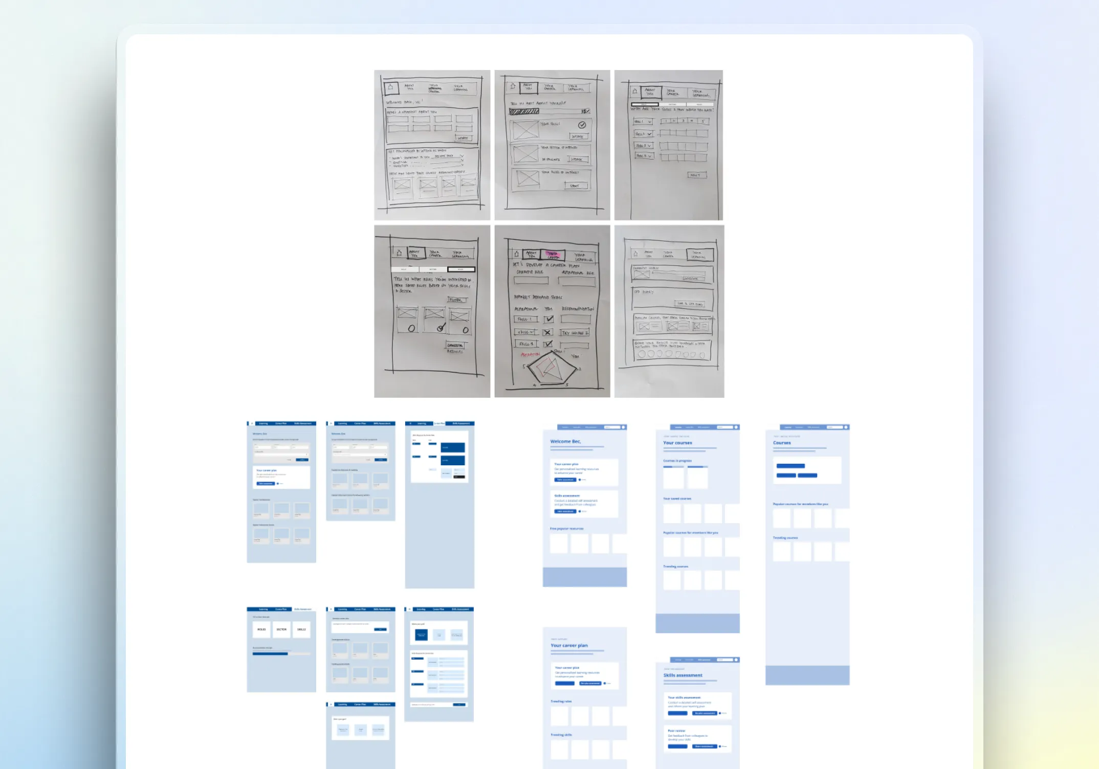
We progressed to mid-fidelity prototypes, conducting user testing rounds with nine members across Australia, Hong Kong, and Singapore.
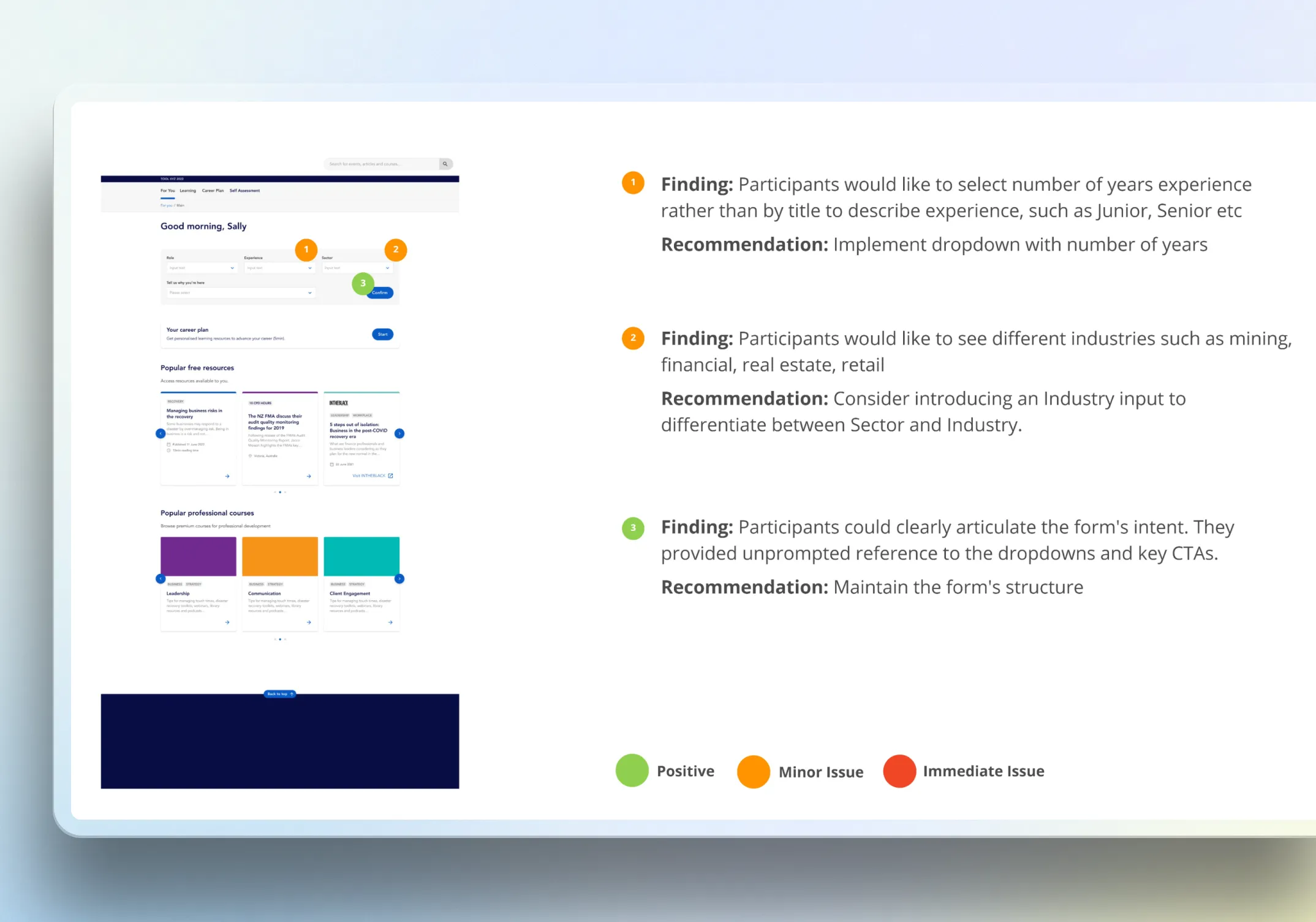
Members expressed enthusiasm for the platform, appreciating its innovation, clear navigation, and relevance.
Because the product was still in concept stage, the work centred on validating structure, navigation, and interaction patterns rather than designing for build-ready delivery. I used the established CPA design system to keep the work aligned with the client’s visual language and existing component patterns, while adapting layouts and interactions for a more streamlined responsive web experience.
Deliver
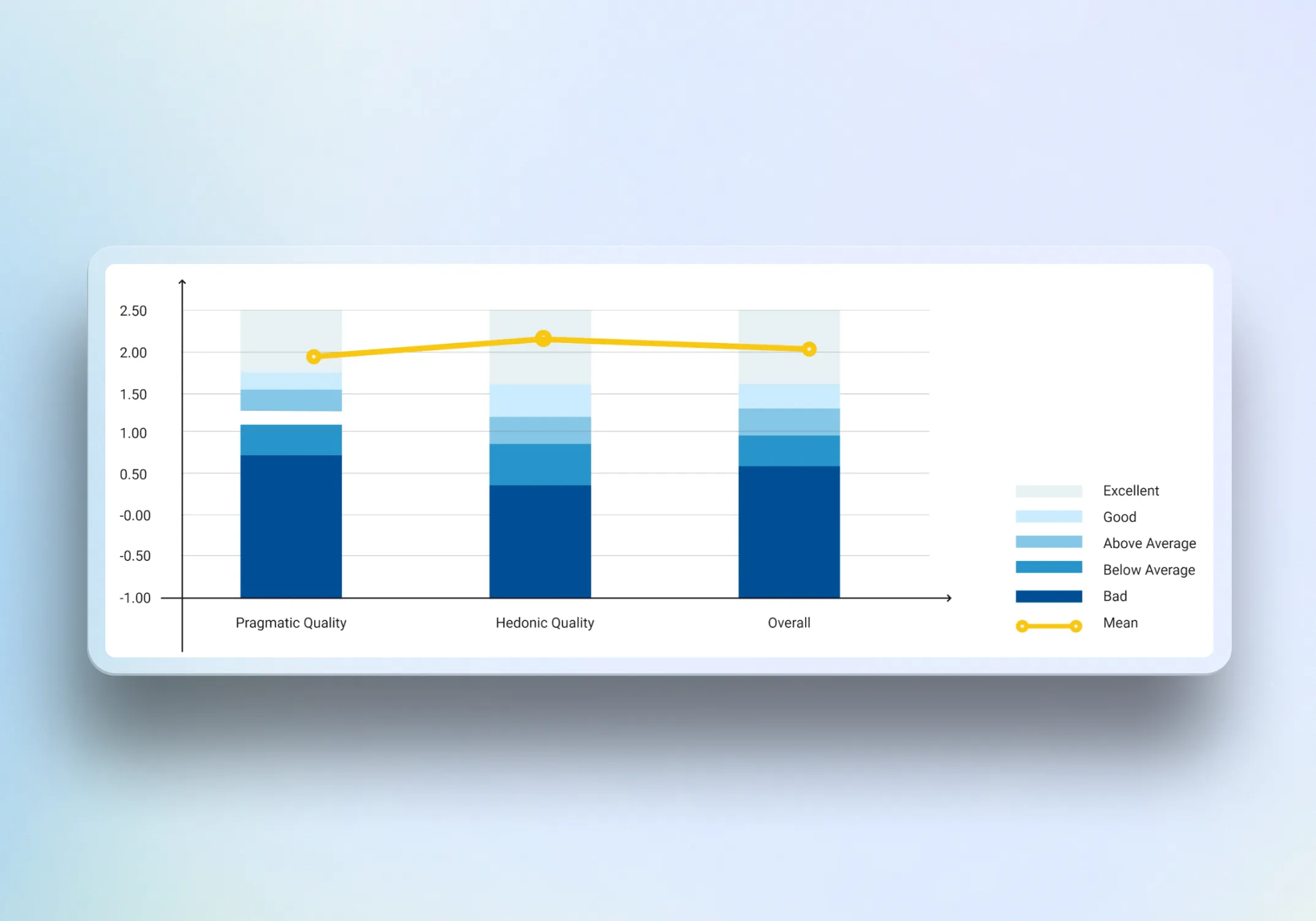
The final phase focused on iteration and validation rather than implementation. Across two rounds of user testing with nine members in Australia, Hong Kong, and Singapore, we gathered feedback on how effectively the concept helped users understand the platform, navigate content, and identify relevant opportunities.
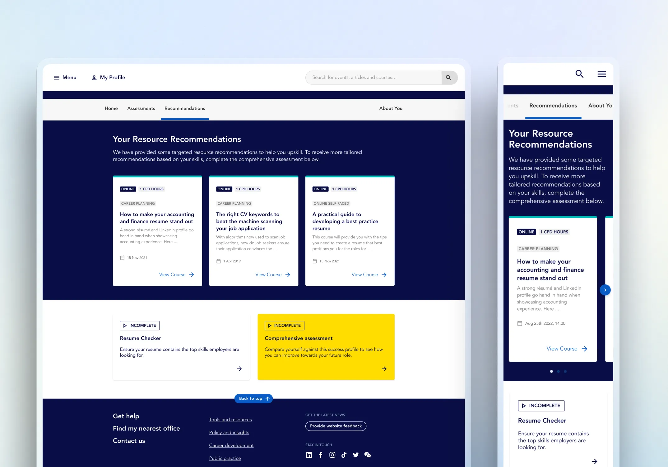
Using affinity mapping, we synthesised findings and refined the prototype into a higher-fidelity future-state concept. The final output demonstrated a more intuitive user journey and gave CPA Australia a clearer direction for how a single platform could better support member career development.
/ Challenges & Solutions
Challenge:
Two separate tools created a fragmented experience
Solution:
I translated research insights into a more unified interface direction that brought mentoring, training, and CPD resources into one clearer responsive web experience.
Result:
The concept reduced fragmentation and made the platform feel more cohesive and easier to understand.
Challenge:
Members felt overwhelmed by the volume and presentation of content
Solution:
I focused the UI on clearer hierarchy, more structured pathways, and simpler navigation patterns so users could scan and find relevant content more easily.
Result:
The concept shifted the experience from content dump to guided exploration, improving clarity and perceived relevance.
Challenge:
The project needed to feel modern while staying consistent with CPA standards
Solution:
I designed within the established CPA design system, using existing visual foundations and patterns while refining layouts and interactions to better support the new platform concept.
Result:
The concept felt aligned to the client brand and system while presenting a cleaner, more contemporary user experience.
/ Conclusion
This project helped reframe CPA Australia’s career development offering from two separate, content-heavy tools into a single, more coherent platform concept. My contribution focused on shaping the interface, prototyping key flows, and supporting user testing to ensure the concept responded to real member needs rather than internal assumptions.
Although the work remained at early concept stage, the outcome was a validated direction that members responded to positively, describing it as innovative, easier to navigate, and more relevant to their career goals. The next step would be to take the concept into more detailed definition, confirm accessibility requirements, and translate the experience into a delivery-ready responsive design for implementation.

